Pharmacy app
UX Case study
Made By:
Øyvind Torsteinsen
Joy Sandvik
Mia Fossum
December 2022
Introduction
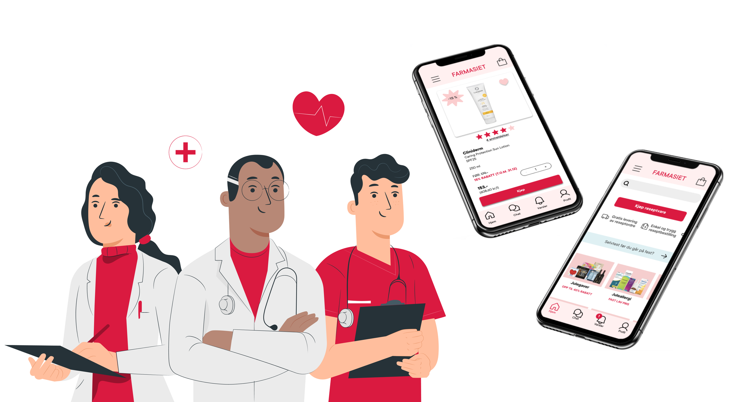
Farmasiet app is the ultimate solution to all your pharmacy needs. With our aim to simplify your life and enhance your healthcare experience, we have designed a platform that combines affordability, availability, and an array of useful functions. With just a few clicks, your required medications will be on their way to you, saving you precious time and energy. We provide you medication reminders and refill alerts, as well ass professional help from doctors online.
Research goals
High priority:
Who is our target group?
How can we make it easier for users to buy prescription medicine online?
Low priority:
Where do people prefer to buy their prescripted medicine?
- How often do people visit pharmacies?
- Why do users prefer to go to physical stores?
- Why would people buy prescripted medicine online?What do the people need from an online pharmacy?
Methods:
Literature review
Survey
Competitive feature analysis
SWOT
Interviews
Key findings from research
Target groups:
Primary: 24-30 y/o
Secondary: 48-59 y/o
Farmasiet would benefit from more branches and advertising to get more online customers.
To meet users wishes and needs we are making an app that contains features and services that fulfils them.
User want:
Good variety of products
Long opening hours
Free delivery
Home delivery
Chat with professionals
Affordable prices
Clear overview of products
Availability
Reward program
User friendly layout
Trustworthy information and payment
MoSCoW
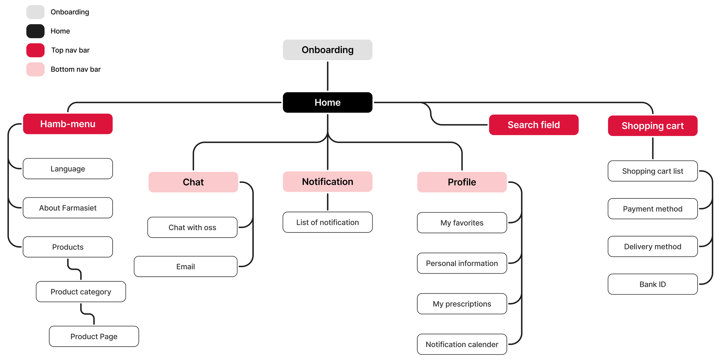
Information architecture
User flow
Mid-fi sketches
Usability test result
Key areas for improvement identified through user testing
Improve the visibility of sale text by increasing the contrast between background and the text. Ad a sales badge or sticker to draw more attention to promotional offers.
Explanation and reasoning:
Users reported that sales information was not clear, leading them to miss out on ongoing promotions or discounts. This can negatively affect both the user experience and potential sales.
According to WCAG (Web Content Accessibility Guidelines), there must be sufficient contrast between text and background to ensure readability for all users, including those with visual impairments. A contrast ratio of at least 4.5:1 for body text is recommended.
Improving contrast and adding visual cues such as a brightly colored “SALE” sticker helps draw attention. This aligns with the principle of visual hierarchy, where important elements should stand out using color, size, or placement.
Include a visible back button on the profile page to ensure consistent and intuitive navigation.
Explanation and reasoning:
Users expect intuitive and consistent navigation throughout the app. The lack of a back button on the profile page created confusion and made users feel "stuck."
Following Jakob’s Law (users prefer interfaces that behave like familiar ones), every screen in the app should follow established navigation patterns. A clearly visible back button gives users a sense of control and prevents frustration, especially if they end up on a page unintentionally or want to go back.
Consistent navigation is a core element of usability and should always be prioritized.
Replace the accept and decline icons on the 'Notifications' screen with clearly labeled text buttons to improve clarity and ensure users understand the actions.
Explanation and reasoning:
Buttons that only use icons (such as a checkmark or a cross) were unclear to many users, who weren’t always sure what action they were confirming or rejecting.
According to Nielsen’s usability heuristics, interfaces should speak the user’s language. This means using clear, descriptive labels like “Accept” and “Decline” instead of relying solely on symbols. This reduces cognitive load and increases user confidence in their actions.
Text-based buttons also improve accessibility and are more inclusive for users with cognitive or visual impairments, or those unfamiliar with icon meanings.
Rename 'My Orders' to 'Order History' for improved clarity, and add it to the hamburger menu for better accessibility and navigation.
Explanation and reasoning:
The term “My Orders” caused confusion among users - some thought it only referred to current or active orders. Renaming it to “Order History” clearly communicates that this section includes all past and present orders.
Clarity in labeling is a key part of information architecture and UX writing. More descriptive language leads to less confusion and a smoother user journey.
Additionally, adding access to the order history via the hamburger menu improves discoverability. Key features should be easily accessible, and placing them in a consistent navigation structure supports navigation usability and helps users find what they need more efficiently.
Prototype
Conclusion
Our research show us that most people would order products home, especially if they can get it delivered at the door, but few people have heard about Farmasiet. It would take time to change people's habits from shopping at physical pharmacies, to start planning and do the shopping online.
With the profile page we made, user can easily find previous orders, favourite products and be able to subscribe to automatic renewal and sending of their prescripted medicine when needed. By making it possible to subscribe to this, we hope to make it easier and more attractive for our customers to use Farmasiet.
We have a vision about a 24/7 available chat where user can get advice from a real pharmacist. This expertise help was one of the main reason people prefer to go to physical pharmacies, and by offering the same service online, we hope to attract more customers. By making an app and making Farmasiet more available in users daily life, as well as giving user notifications and providing a safe and simple solution for getting their regular prescriptions, we hope to attract more and more users into the Farmasiet’s online platforms.
Through usability testing of the prototype, we identified several key areas for improvement that will enhance both the functionality and overall user experience. By addressing these issues based on UX best practices and direct user feedback, we are making Farmasiet’s digital platform more intuitive, trustworthy, and accessible. These refinements not only support our goal of making pharmacy services easier to use and always available, but also bring us closer to building long-term trust and engagement with our users in their everyday lives.


